Collibra's New Design System
UX/UI Design, Figma Prototyping, Design System

What is Collibra?
Collibra is a white-labeled data management website that is sold to other companies like Starbucks, American Express, etc. Data loaded inside Collibra can be updated, accessed, managed, and protected so companies can make informed business decisions.
There are three main types of users: Analysts access data for reports. Data Engineers put the data into Collibra. And Governance Mangers control and manage access.
Arbor Aspen to Banyan
In 2022, the #1 piece of feedback Collibra received after failed sales engagements was "the UI is ugly" and "not user-friendly." Our Arbor Design System needed a major upgrade, and fast! Colors and typography were revamped, flows were simplified, sketches and mockups were presented, detailed designs were delivered and reviewed. All the while, we gut-checked ourselves constantly with users and key stakeholders to ensure Banyan was beautiful and true to the Collibra spirit.

From “Ugly” to “Friendly”
Since Banyan was released in mid-2024, our hard work has paid off!
- 110 (16%) of customers participated in the largest beta in company history
- 75% customer adoption in production
- 95% customer adoption in at least one environment
- Customers who called us “outdated” now call us “friendly” and “effective” instead

Blue as a Primary Action Color

Teal as an Accent Color

Elevation to Clarify Context
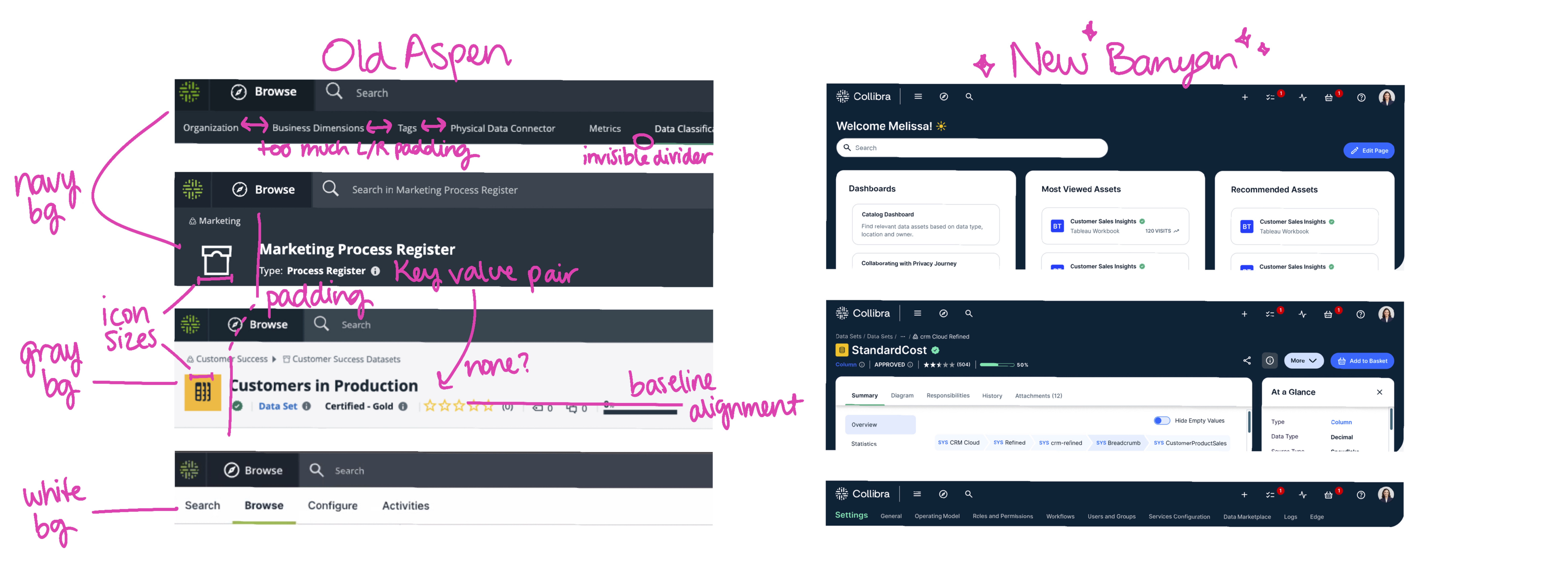
Standardizing Header Designs
Collibra’s old page header had different background colors and inconsistently sized components and spacing. I standardized the header patterns for all page levels. I delivered pattern documentation to designers and annotated mockups to developers and collaborated directly with 20+ product teams to implement the correct page header for their respective product areas.


“Banyan-izing” All Figma Components
Once the design direction was approved, we had to migrate all of Collibra in preparation for a private beta within 3 months. I updated components to the new Banyan look and feel, creating detailed notes about the UI changes for each component and met with developers to find the best solutions given the time constraints we had. Here are some examples:
Switch Component

Card Component

Search Component

Page Layout Pattern Clickable Figma Prototype
The most complex page layout in Collibra is the “Community Page.” It’s a page that organizes asset pages into categories. For example, in Collibra’s Product Community Page, we can see all the official Business Terms (asset pages) the Product Team uses like A/B Testing, Accessibility, etc.
Community Pages can have an open Filter drawer, Preview drawer, and Task side bar open all at once. I gave this clickable Figma prototype to developers so they knew how to manage the interactions.
Looking Forward
Keep Iterating on Feedback From Public Beta
